Within the world of the book lover, perhaps the most comforting and reassuring place to be is in the bookshop. Whether settling down to do some work at the coffee shop within, or simply browsing the shelves to wait out a rainstorm, there’s nothing quite like being surrounded by books.
But what is it that makes a bookshop seem like the place to be? Contrary to what our hearts wish to believe, this haven to the bookish soul is a business and the centre of the brand is required to be displayed to a potential customer.
The two giants of the western Book Industry (bookshop-wise) lie across the Atlantic from one another: Barnes & Noble and Waterstones. In 2019 the CEO of Waterstones James Daunt bought Barnes & Noble but despite belonging to the same parent company (Elliott Management Corporation), the two chains are designed very differently. The more obvious element of their branding would be the typography that they choose to use.

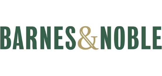
The American super-store Barnes & Noble encompasses the American look with the words ‘Barnes’ and ‘Noble’ boldly stamped out in Bureau Grot Comp Medium which is from the Bureau Grot family. This font fills the eyes of its reader, claiming its space just as the company’s buildings themselves impose upon their customers. This is a font simple in style that is similar to others like Bebas Neue and Oswald. With minimal tracking between characters and completely capitalised letters, Bureau Grot Comp Medium is easy to read and impossible to miss.
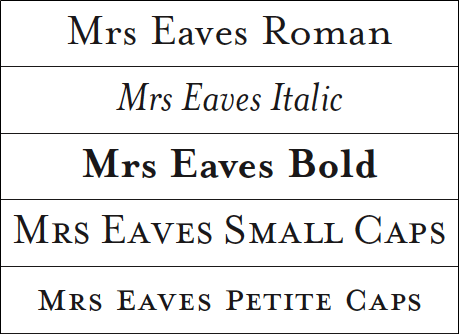
Originally, the word ‘Booksellers’ took up its place, within the logo, beneath the company name. It was set in a traditional serif font called Mrs Eaves OT Bold which perhaps mimicked fonts commonly found in the text of most novels. Within recent years, the chain decided to drop the additional text and simplify the logo to keep up with the current trends in design, adopting a more minimal look. However, many stores are still yet to update their signs.

What could be seen now as the only characterful piece in the brand’s typography is the ampersand found between the two company names. The uniform, blocks of green are broken up by a golden, sometimes orange, symbol simultaneously destroying the harmony and physically and theoretically joining the Barnes brothers with their co-founder G. Clifford Noble.
Despite having launched well over 100 years ago, Barnes & Noble remains one of the giants in the book industry with over 600 retails stores and near-worldwide recognition.

Like Barnes & Noble, Waterstones is named after its founder Tim Waterstone. However, unlike its US equivalent, it was only founded 38 years ago and is represented by far fewer stores. Another difference that the two companies share is the contrast to one another in terms of their typography.
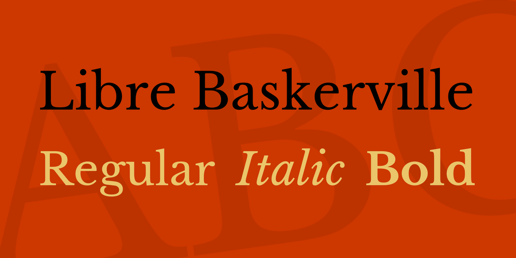
The word ‘Waterstones’ stands alone, unobtrusive but bold in its simplicity. The typeface the word is displayed in is one of the most recognisable ones across the globe: Libre Baskerville. Baskerville is a serif typeface that was designed in the 1750s by a Mr John Baskerville. While elegant, it remains easy to read and unlike earlier serif fonts, has a larger distinction between the strokes it uses. These features make it very popular in book design which is most likely the reason why Waterstones claimed it as their own.

Despite the popularity of the typeface, the Waterstones logo is easily identifiable. The association with the written word allows what could have been a rather plain font to be a characterful, strong logo for the brand. The consistently, monochromatic look again emphasises the idea that this is a brand about books, giving the impression that the letters have been freshly printed with ink on to its website and stores.
