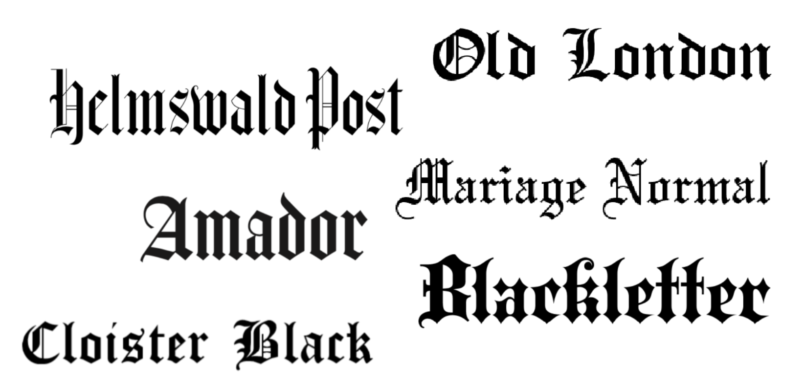
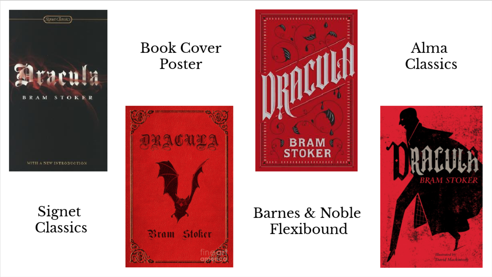
Out of all of the elements of the term Gothic - think haunted mansions, glowing candlelight and howling winds - great works of literature come to mind. Perhaps the most infamous example of these is the literary masterpiece that is Dracula by Bram Stoker. There have been many different editions of Dracula since its publication date in 1897 but when it comes to the cover designer’s choice of typography one style reigns triumphant: Old English.

Old English was commonly used throughout England, France, Germany, Italy and the Netherlands between the 12th and 17th centuries. With a medieval influence, the typeface is characterised by its use of heavy and dramatic strokes with a particular flourish on capital letters.
Interestingly, Dracula wasn’t published until the 19th century however Stoker does describe the Transylvanian landscape in dramatic settings with the ancient and monstrous character of Dracula having existed in the gloom invoking a past, forgotten time. Similarly, Dracula is thought to be inspired by the 15th century Wallachian Prince Vlad the Impaler putting the character right in the middle of the typeface’s popularity point. He is also described to be ‘centuries-old’ which would also most likely put him in the right place for use of the Old English typeface.
A genre that was particularly popular during the Victorian era was Gothic literature. It allowed authors to step back in time and create something that was truly atmospheric and captured a different time and place. The style of the Old English typeface invokes the idea that the title was written in a fountain pen or at least with a quill pen and inkpot. This old fashioned style suits the age of the book and the branding of the book as a classic which is important to emphasise in bookselling.

The typeface is most commonly seen in black, red or white when associated with Dracula. Bright red is used to represent the vampiric main character and his taste for blood, and the black that it is often paired with lends to the gothic element and hints at sinister things to come.
