Twelve times a year subscription box company FairyLoot sends 6-7 bookish goodies out to their customers along with a signed, hardcover new release to add to their bookshelves.
The brand has gained popularity after gifting their boxes to various Instagrammers, Bloggers and YouTubers to feature in their posts via unboxings or photographs displaying items.
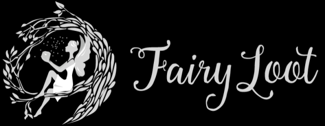
FairyLoot clearly reveals themselves as a subscription box based around books within the Fantasy genre. A fairy is seen sitting in a wreath made of branches or twigs, holding a jar as she releases fireflies. Next to her lies the Fairy Loot typographic logo.
The typeface that the logo is written in again lends itself to the fantasy genre. It is called Anitasha and it is handwritten in-style with twining, flourishing serifs. It is a modern, pretty, script font that is popular for wedding invitations and posters. The serif on the ‘F’ looks like a vine extending from the letter itself.
Interestingly, there is no reference to books within the logo or even symbolically within the text. The box relies purely on the fantasy element to attract subscribers. As the box is for young adults, perhaps the fairy hints at the box being a youthful one.

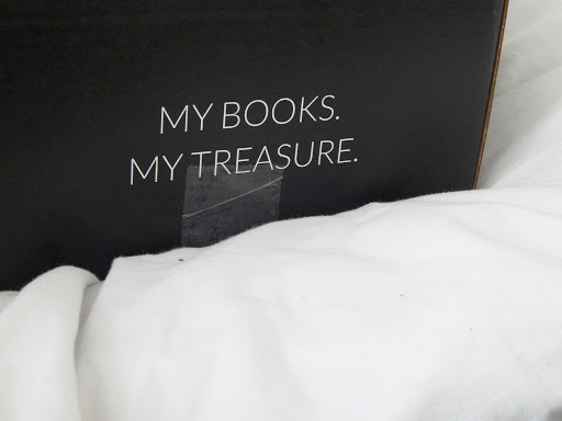
The front side of the box has a piece of text that says ‘My books. My treasure.’ which is displayed in Modulus Pro. It is easily readable as it is sans serif and completely capitalised allowing it to contrast against the company name as discussed before.
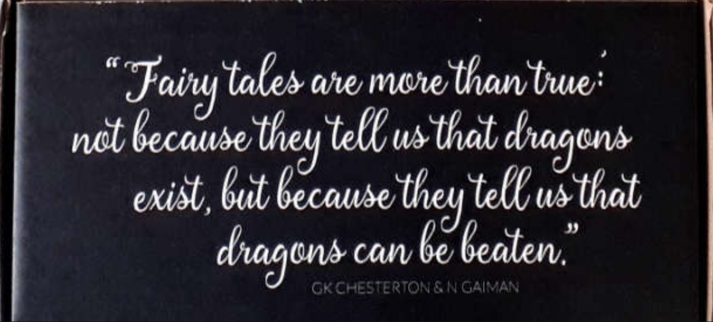
The inner side of the box has a quote by Neil Gaiman on it (which he attributes to G.K. Chesterton) that futher emphasises the fantasy theme with talk of fairytales and dragons. Again, the company has chosen to use Anitasha; a looping cursive-style font.
The authors’ names are also written in Modulus Pro but is displayed in less transparancy than the other text so as not to take away from the brand of the box which is shown in the form of the quote above it. It is a sans serif font that is not nearly as decadent as Anitasha so as not to draw attention to itself too much.
